
 Continue with onX Maps
 Sign in with Facebook


Route grade vs boulder grade – a data-based analysis

|
In the last year, I've learned rudimentary skills in the data analysis program R. I wanted to practice my new skills using a dataset that was interesting to me – luckily, I managed to find this dataset on Kaggle. It contains 400,000+ lines of data collected from 8a.nu in September of 2017. This data includes most user's logged routes, as well as related information such as grade, style of ascent, etc.
This data generated the following box plot graph, with boulder grade on the x-axis and route grade on the y-axis. 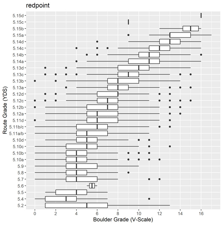 A few notes and assumptions: - This is self reported data, and we assume all data is reported truthfully. There is no way to know which are true and which are not, though there are some obvious outliers that we could probably assume aren't real. A majority of the data looked to be within the realm of reasonableness. - We assume that these numbers are maximum ability, although we know that is not the case. Not every route climber boulders, not every boulderer route climbs. Again, no way to know, so we have to take the data at face value. - The data may be slightly skewed toward higher bouldering grades since I used maximum ability rather than average ability. These data points could represent someone who happened to send one V7 but has only managed a 5.11 route; in reality they might only be regularly sending V4/5 and the occasional harder boulder. - There is no component of route style involved in this analysis, although we can assume that the lower the boulder grade per route grade the more endurance oriented the route is, rather than boulder crux oriented. - Some of the scale related weirdness is due to conversion of grades and the way you have to format the data for R to be able to read it. So in this case, 5.11a/b is 5.11-, 5.11b/c is mid 5.11, and 5.11d can be 5.11+ or so. - Climbing grades are all made up anyways! So take this all with a grain of salt ;) So, some discussion on results: On reading the box and whisker plots – the left whisker represents the bottom 25%, the left box represents 26-50%, the bol line represents the median grade. Right of the median, the next section of box represents 51-75%, and the right whisker represents the top 25%. The dots on either side represent the outliers of the data. Here's a link with more discussion on how to read box plots.
- 25% of climbers sending 5.11- have sent V4 or V5, though we can tell by the long left tail that there is a large range of lower boulder grades. - Most climbers who have sent 5.12a have sent a boulder between V5 and V8. - Most climbers who have sent 5.13a have sent a boulder between V7 and V9. - To send 5.14a, you could have a max boulder as low as V6 – though you would be near the bottom of the percentile range. The blog post above discusses the endurance route Southern Smoke, 5.14c, at the Red River Gorge, which apparently has "no move harder than V6". Although, I would be prepared to climb V6 moves for the entirety of its length to earn that grade. This information could be handy for many of us trying to break into higher grades. If you want to climb 5.12-, but have only ever sent V3, it may be worth your while to boulder a little more. While certainly not unheard of if you pick your routes correctly, it would be easier to send your goal route if your bouldering grade were a little higher. (Though, there are many factors that go into redpointing – but look elsewhere for discussions on that). Same thing for the 5.13 grade - if you can consistently send V7 you will be better set up for the grade than if you can only consistently send V4. Anyways, I'm no data analyst – I just wanted to share what I worked on for practicing my skills. Hopefully some of you find it entertaining or informative as well. If anyone is curious, I can easily post my R code, thought it is somewhat of a mess given my novice ability at writing code. Feel free to post up if you have any insights into this data or any questions! |
|
|
looks good to me |
|
|
Nice job buddy, hope you send your project. Cant wait for the data |
|
|
The bottom half looks off to me. Kind of like all the boulderers who rarely sport climb are dominating this area. |

|
Kees van der Heiden wrote: Agreed. Kinda way off. Statistically it appears a 5.10b is about a V4 and a 5.2 is about a V5. You have a datapoint equating a 5.4 with V11 Somehow you need to scrub outliers where the climb grade and V grade delta is too high Maybe take the slope of the upper half of the data (likely more accurate) and regress it back to get a “what it should be” graph. |
|
|
Mark Pilate wrote: As mentioned in my assumptions, there are many outliers that are seemingly impossible – but there are many more data points in the center than the outliers. Maybe I'll post another visualization showing density, because with nearly 13,000 data points, most line up pretty well clustered in the center of the bouldering grades. I also think the skewed boulder grades are again because people reporting their own data may not route climb that often. There's not really a way to tell.
|
|
|
With the caveat that some folks pretty much just boulder, while others hardly boulder at all, your analysis looks spot on. Well done. |
|
|
Kyle Smith wrote: When you pull in the max route grade and boulder grade pull in a count of the boulder grades and a count of the sport grades. If count for both exceeds 10 then use them in the data. I think that would remove a lot of outliers. Either way good job, I am pretty much average boulderer for my sport climbing percentile. |
|
|
Nice work. Do you have access to dates? - I think it would be logical to have a time window for comparing redpoint grades for both boulders and routes. |
|
|
Finally, hard proof that 11d is really just 12a |
|
|
Adam bloc wrote: Or.....since it’s likely the 5.7 and below were trad routes and the 5.10 and above were sport, is this hard proof that Gunks 5.6 is really same as sport 5.11 ? lol. |
|
|
Alright, played around with my code some more this morning taking in some suggestions here and my own idea of median. Here is a graph with data only from users who had logged at least 10 redpoint routes and 10 redpoint boulders. Note that this means that they logged at least 10 of each regardless of grade, i.e. they could've logged 9 V1s and a V7 or one of each grade from V0 to V10. It doesn't necessarily mean that all outliers are removed, but it does seem to have cleaned up the worst data points where people might only occasionally do one discipline. Once again though, on 8a.nu, many people only log their harder ascents, not their lower graded climbs so this data is likely still skewed toward harder climbs. For this analysis I used the median grade boulder, which is a measure of central tendency that takes the middle number of an ordered set. This is a good measure when data may be skewed, so I think it lines the bouldering grades up a little better. For the route grades, I still used the maximum grade to see if your median bouldering grade could be predictive of your maximum route ability. 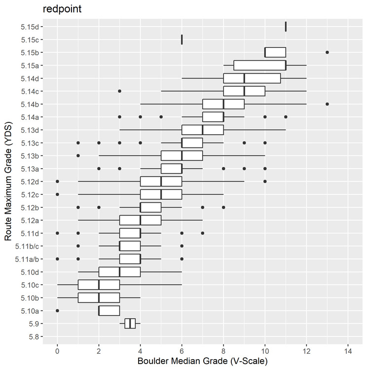 This graph contains 6211 data points – nearly half of the first graph's data points. Another note about this data is that most people on 8a.nu log sport routes; so I would assume most of this data is related to sport climbing. However, hard trad climbing often translates pretty well to hard sport climbing.
- 50% of people climbing max 5.10c and below had a median boulder of V1 to V3 - 50% of people climbing max 5.11d (which is 7a in French grades, important to remember since 8a.nu has a large, probably majority, non-American user base) had a median boulder grade of V3 to V4. (Which, as noted above, is basically the same as 5.12a ;) ) - 5.12+ means bouldering regularly at the V4 to V6 level - 5.13b (8a French grade) means you can boulder consistently in the V5 to V7 range - If you regularly climb at the V7 level, you could potentially send up the the 5.14 level (again, many other factors contribute to route climbing ability... but it's certainly possible! Especially if you can do V7 in a few tries.) Anyways, I like this graph a little better. I think average bouldering ability is probably a better metric when compared to maximum route ability. And thanks for the suggestions, the minimum 10 routes logged actually cleaned up the data quite a bit. Also, this dataset does have dates associated with the logged routes, though I'm not sure how I could incorporate that. It seems like it would be far too complex and potentially not super informative to try to correlate dates. Good ideas though! |
|
|
You've earned your MS in Data Analytics from 8a.nuniversity. The second chart constrains the data a little better. Nicely done. |
|
|
I am quite curious how predictive of bouldering grade to sport climbing is with this change. |
|
|
Nice work Kees van der Heiden wrote: Bottom half is what I would expect: bouldering strength is not a major determinant of route climbing standard below 5.12. |
|
|
Haha, also further proof that the dreaded 5.9+ Is harder than 5.10d. Funny. |
|
|
Yeah, you need to exclude all climbs in the Gunks, because in the Gunks this would be 5..... I feel something like a 2d heatmap would talk more. If using a 2D heatmap, you could also add some data treatment to "weight" each data point (as oppose to just consider they are all equal). For example:
I'm more of a numpy/scipy programmer, haven't coded anything in R. However I'm sure lots of other here have, and if you want to share your code, and want to devote a little bit of time to that aspect of things (e.g. code version management), you should have a look at github. What I linked is their "Hello world" tutorial (the 5.4 beginner-friendly of programming, kind of). If you're on windows, you could install github desktop to have a visual interface if you're not much of a command line person. If you don't plan on coding stuff much in the future, this is probably overkill. However if you want semi-competent programmers to have a look at this and potentially contribute, putting open-source on github is BY FAR the best way to make that happen. Depending on your technical inclinations, getting the basics of github, e.g. enough to be functional with it & publish the updates of your code (and potentially pull updates from other contributors), can definitely be done in a week-end. But then depends on what further you use you think you may have for those skills, your interests as to whether or not its worth your time. |
|
|
Agree with some other comments that you should eliminate the outliers and possibly the grade ranges with very small n-sizes. Interesting nonetheless. |
|
|
Franck Vee wrote: Thanks for the github info, I've learned a little bit about github but I'm pretty shaky on its use overall. It integrates well with the R Studio program but I'm still working on learning how to use it effectively. That's something I'll likely dive into learning in the future. As for different visualizations, here is a quick density plot I made. It visually represents the distribution of the data little better. However, I think I still prefer a boxplot, as it is easy to see a range of boulder grades vs route grades (i.e., most climbers sending 5.12 send V3-5 or whatever). Though, it is nice to see the data multiple ways. As for an actual heat map visualization, I'm not super familiar with how to use them effectively. As for weighting different users in this data, I think it could be cool, but sounds tough given my current skill set. I think with 6000+ observations for this graph it all somewhat evens out - it looks like most climbers are in the "average" anyways. But, all good ideas and I appreciate the feedback! 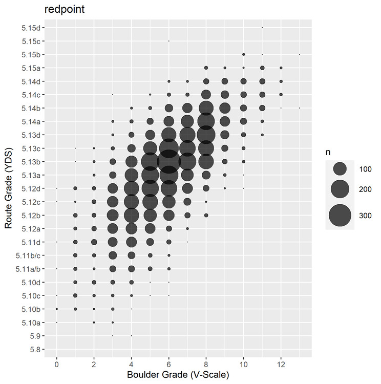 This graph counts the number of individual data points and sums them, giving them a bigger dot based on how many are in one place. We can see that 8a/5.13b with a V8 boulder appears to be the densest point out of all the data. It also seems that a majority of routes recorded are between about 5.12b and 5.13d, and most of the boulders recorded are between V4 and V8. C G wrote: As for removing (more) outliers - this is the crux of all data science. This is just fun data to play around with so it doesn't really matter, but how do you decide what's a valid and invalid data point? In this case there's plenty of arguments to be made about what is and isn't valid in the context, but in other cases it's not so straightforward. |
|
|
Kyle Smith wrote: I come from the land of finance, and a methodology often used there to compensate for statistical outliers is called Winsorizing or winsorization. I haven't looked at your data with any real depth to say if it makes sense here, but might be worth looking at. Either way, thanks for posting this. I love the cross-section of geeks and climbers. |


