
 Continue with onX Maps
 Continue with Facebook
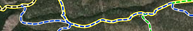


Rumney Traffic Map


|
|
Hey Rumney Climbers, |
|
|
Looks good. Its what I expected to see for the results. Not to many surprises. |

|
yeah, can you share the details, i'm interested. |
|
|
Nice Eli! |
|
|
I'd also be curious to hear methodology. Did you just sit here with a clicker for an afternoon? |
|
|
I'd also be curious to hear methodology. Did you just sit here with a clicker for an afternoon? |

|
Pretty cool - expected for the most part (Waimea, MC, Bonsai, OC) |
|
|
Scott Phil wrote:Regarding the suggestion of percentages--that is built in through the proportional size of the circles.I think we're talking past one another. Here's what I'm saying: My interpretation of this (Eli, stop me if I'm wrong here) is that colors are assigned on an absolute basis. So when Below New Wave is the same color as (say) the Hinterlands, it means that the two see roughly the same number of climbers. But the Hinterlands has a great many routes, so the actual impact of this many people is lessened. Essentially what I'm getting at is if you're looking to ask "will I have a good time?", the metric you really care about is perceived crowding--climbers divided by routes--rather than a total headcount. |
|
|
Lavery wrote: I think we're talking past one another. Here's what I'm saying: My interpretation of this (Eli, stop me if I'm wrong here) is that colors are assigned on an absolute basis. So when Below New Wave is the same color as (say) the Hinterlands, it means that the two see roughly the same number of climbers. But the Hinterlands has a great many routes, so the actual impact of this many people is lessened. Essentially what I'm getting at is if you're looking to ask "will I have a good time?", the metric you really care about is perceived crowding--climbers divided by routes--rather than a total headcount.Yeah, a climbers vs available routes heat chart might be more meaningful. |
|
|
Of course now that I say that, if a wall has 7 5.13+ routes and 2 5.9s, availability might be relative since 5.13 is unavailable to the majority of climbers. |
|
|
Lavery wrote: I think we're talking past one another. Here's what I'm saying: My interpretation of this (Eli, stop me if I'm wrong here) is that colors are assigned on an absolute basis. So when Below New Wave is the same color as (say) the Hinterlands, it means that the two see roughly the same number of climbers. But the Hinterlands has a great many routes, so the actual impact of this many people is lessened. Essentially what I'm getting at is if you're looking to ask "will I have a good time?", the metric you really care about is perceived crowding--climbers divided by routes--rather than a total headcount.Good points--and I totally agree with the important question of "will I have a good time?" The challenge is how to clearly convey this information graphically. For example, it might help if the traffic data were portrayed as actual numbers rather than a range of low to high. In theory, you could also depict the traffic colors in relationship to the number of climbs though depending on how it was done that would potentially make the map harder to read. Even then, it would depend on the popularity of individual routes for each area. For example, an area with low traffic may still have a line at the base of a popular route. In the interest of full disclosure this is all academic for me as I've not yet climbed at Rumney, though I used to make maps for a living. |
|
|
looks like it's a map of "number of routes per crag." It might be better named that. Or perhaps "route density map", but that's not quite the right term, because a large crag will have more routes. Traffic map might be a little misleading, because that implies the number of people on a given day or hour. This map shows number of route developers over the decades. |
|
|
Last night I wrote a long post explaining everything, hit submit - and mountainproject timed out. Here it goes again, I'll definitely hit copy before I hit submit this time around. |
|
|
Lavery wrote: I think we're talking past one another. Here's what I'm saying: My interpretation of this (Eli, stop me if I'm wrong here) is that colors are assigned on an absolute basis. So when Below New Wave is the same color as (say) the Hinterlands, it means that the two see roughly the same number of climbers. But the Hinterlands has a great many routes, so the actual impact of this many people is lessened. Essentially what I'm getting at is if you're looking to ask "will I have a good time?", the metric you really care about is perceived crowding--climbers divided by routes--rather than a total headcount.You're correct. |
|
|
Here is my data, it may be a mess to repair the sources for your copy of arcgis, but I wish you luck either way. |
|
|
Great idea! Last year the USFS was asking people to complete a survey about where they went and climbed, how many in party, how many routes and how long, etc, so a form of the usage data is out there. |
|
|
Eric LaRoche wrote:Of course now that I say that, if a wall has 7 5.13+ routes and 2 5.9s, availability might be relative since 5.13 is unavailable to the majority of climbers.This is the most important thing - route availability for routes that you actually care to do. It's better to give raw data and allow individual extrapolation, IMO |
|
|
I assumed you used the MP data on the number of people in, say, the past year who ticked routes. Wouldn't that be the best practical way to figure out how much traffic an area gets? It seems that factoring in things like rock quality doesn't tell much about how many people are actually climbing there. |
|
|
Jon Frisby wrote: This is the most important thing - route availability for routes that you actually care to do. It's better to give raw data and allow individual extrapolation, IMOIt is a little difficult to not be an individual when you are the only one working on something, and the raw data is totally subjective anyway. It should be noted that Rumney attracts a lot of hard sport crushers, so it may not be that invalid. |
|
|
Bill Shubert wrote:I assumed you used the MP data on the number of people in, say, the past year who ticked routes. Wouldn't that be the best practical way to figure out how much traffic an area gets? It seems that factoring in things like rock quality doesn't tell much about how many people are actually climbing there.I felt like rock quality was a valid critera, because it is certainly a deterrent for some people. Also it isn't necessarily just rock quality that I was looking at, but more rock/route quality (number of stars and if I've pulled blocks/rocks off climbs at different crags) I do appreciate the feed back, and would love to improve my map at some point. The end goal is hopefully that different crag-maintenance organizations can more easily plan for trails and trail upkeep. Basically the idea is that climbing is growing, and things are going to have to be maintained - I believe that major crags are going to have to undergo some planning process, and that resources like this could prove to be really helpful. |
|
|
JohnnyG wrote:looks like it's a map of "number of routes per crag." It might be better named that. Or perhaps "route density map", but that's not quite the right term, because a large crag will have more routes. Traffic map might be a little misleading, because that implies the number of people on a given day or hour. This map shows number of route developers over the decades. I guess you make the assumption that # routes predicts # of people at any given time it's a beautiful map. pretty cool. love gisGetting back to this - The traffic prediction comes from other data that I put into it, along with the number of routes. The symbol size changes mostly just to reflect the size of the area we're dealing with. A number of routes per crag map would have been a hell of a lot more simple to make. The actual data appears in the color spectrum - but the number of routes has an influence on that as well, which is why you see the correlation so clearly. |


