
 Continue with onX Maps
 Continue with Facebook


Calling all photo lovers! Choose the best photo!
|
|
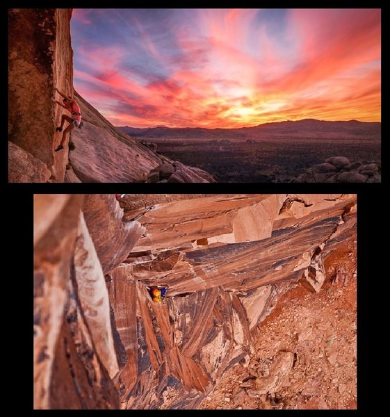 The magazine Rock & Ice is holding a climbing photo competition in which the person whose photo has the most “likes” wins a spot on a 3-day photo camp with some professional adventure photographers. However, the way the gallery is setup seems biased because it’s arranged alphabetically by the photographer’s first name. It doesn't seem like a coincidence that the photo with the most votes (taken by a guy named Alain) is the very first one that comes up when you click to see the gallery. My photo, which is in second place as best as I can tell, is buried back on page 20 and who’s really going to go through all 40 pages of photos? I thought about posting my photo under the name Adam or something but that just wouldn't be honest, so instead I’m appealing to all you netizens determine our fate :) To vote for the top picture click here: www.rockandice.com/photo-camp-contest/justin-kenderes-1 To vote for the bottom picture, click here: www.rockandice.com/photo-camp-contest/alain-delatejera-1 It may very well be that the very first picture in the gallery is also considered to be the best…I leave it to you to determine. Vote for whichever you feel is the best *climbing* picture knowing that the winner will have to opportunity to go and shoot professional climbers with top photographers in the field. Share and repost and let’s see where this goes! I just ask that if you repost you include this description with both links. Peace :) |
|
|
Like how you compare your picture to a relatively crappy one and ask, essentially, for people to vote betwene the two. |
|
|
Justin, I think your photo is pretty sweet, but I can't bring myself to participate in the contest because the way the gallery is set up is so awful, I don't have 20 minutes to go filtering through a bunch of crap to look at a few nice photos. |
|
|
+1 for Alains photo! |
|
|
Oh my god arm chair quarterbacks. That is a kick ass photo. |
|
|
Jason Kim wrote:Since Davis wants to turn this into a photo critique session, I think it's a fine composition and I like how Tia's top matches the color of the sunset. I would like a bit more room on the bottom, 'distracting junk' includedFYI, I'm this hard on myself with my own work, too! You can never improve as an artist if you see all yoru work as fantastic or perfect. It is very nice. Seeing more at the bottom, it would no longer be distracting junk, haha. Just enough more to bring that formation into the midground with the slabs in the back, methinks. Beautiful sunset, though! I've seen maybe 2 or 3 photos ever that could use NO improvement... so don't take those comments as it being a crappy picture. (like Alain's) |

|
The colors in the top picture are great. It's too bad that the subject is on toprope instead of on lead and appears to be hanging on the rope... |
|
|
Jason, |

|
At least Alain doesn't feel the need to go on mountain project and insult your picture. I know Alain and he is a good guy. I hope he wins, this would be a great opportunity for him. |
|
|
Davis Stevenson wrote:Jason, Just voted for you. Not a perfect photo, but MILES ahead of EVERYTHING else I saw.Justin's photo, my brother. |
|
|
Jason Kim wrote: Justin's photo, my brother.Yeah, exactly. Oops. I'm terrible with names, even when they're sitting on a computer screen directly in front of me. |
|
|
Nick Zmyewski wrote:At least Alain doesn't feel the need to go on mountain project and insult your picture. I know Alain and he is a good guy. I hope he wins, this would be a great opportunity for him.To be fair to Justin, he didn't insult your friend's photo. All he did was raise the point that the gallery is alphabetized by first name, which is pretty lame. |
|
|
Jason Kim wrote: To be fair to Justin, he didn't insult your friend's photo. All he did was raise the point that the gallery is alphabetized by first name, which is pretty lame.Maybe he didn't, but Davis did on two occasions which is obviously disrespectful. Thanks, Davis. |
|
|
Yeah my mistake. I read Davis' comment and for some reason my brain thought Justin made the comment. Sorry Justin. And I agree that the gallery could have been set up differently. |
|
|
Alain Aleksandro De la Tejera wrote: Maybe he didn't, but Davis did on two occasions which is obviously disrespectful. Thanks, Davis.Don't take it so personally. Tell me, in terms of photography, why that makes a good photo. I didn't mean it as an insult to you or anything, just that it's missing several elements that make up a quality photo. It is a photo contest, aren't we supposed to be critiquing all the photos and deciding which one is best anyway? Should have nothing to do with the feelings of the photographer, and I meant no insult to you personally. |
|
|
By calling it crappy? I see. |
|
|
I think the winners are posted here: |
|
|
Kudos to Alain for winning the contest, and for taking the high road in this thread. You must be a positive dude. |
|
|
Chris treggE wrote: Like what? Not trying to be thick about it, I am geniunely curious. Looks like the winner will be announced tomorrow.Congrats, Alain. You will learn a lot at the camp. But to everyone else, Google 'what makes a good photo'. There are so many different answers, but most will include most of what I say below. Yes, the second image does tell a story, but it's much harder to relate to to a non-climber. Here's several key things, not in any particular order (skipping the obvious things that digital cameras do for us-- exposure, focus, etc) Framing Color Contrast Texture DOF Perspective Lighting Mood A good photograph must use most or all of these. A good photograph will draw a viewer in from a distance, and hold their attention. Framing-- your subject is way down there, adds to the mood and everything, but you have to get up close and personal to see what's going on, and I doubt the non-climber could figure it out so quickly. Maybe a longer lens, or different positioning.. Color/Contrast-- 99% oranges and browns. You have very little contrast. With good contrast, colors can be your subject. When more than half of the subject is the guy's orange helmet, close to the same color as the background, it keeps the subject from popping and drawing attention. Just like the notion that a good B&W photo needs black, White, and everything inbetween, your photo is lacking any kind of range of colors that can make a good color photo. Look at Justin's photo-- look at how the colors of the sunset really pop from the sky, just like the edge of the rock pops out from the sky, too. Look at that comparision photo and zoom your browser way out. Which would you take a closer look at? The one where the colors pop, or the one that becomes orange/brown mush? Texture-- Easy with climbing. Rocks have awesome texture and I love it... Why I've been doing DOF-- the top down shot like that is always tough-- you're too close to the rock up top to get everything in focus, and now you have a blurry, and not really in an interesting way (although hard to see if bokeh is nice at such low resolution). Personally it looks distracting to me on such a broad landscape. Unfortunately, the only way to keep this from happening would be either a view camera or a tilt+shift lens, the former being bulky and slow, the latter being exceedingly expensive. Perspective-- Difficult with climbing, too, as your frequently directly above or below your climbing partner. I'm sure at the camp you'll learn some positioning type techniques, and how to pick your position. They could teach a whole 3 day camp just on that. Being so far above the climber and having little contrast makes the photo almost flat. Again, to a non-climber, it may as look as he's barely off the ground, or thrashing up something not even vertical. There's no sky, nothing particularly interesting on the ground, or even something affected by gravity to help us understand that this guy is climbing something vertical. Lighting-- Another tougher one with climbing. You basically have to deal with what you get. Nothing really wrong with your photo in this regard. Mood-- What is the mood in your photo? I can't even tell. Quality art will evoke some kind of emotional response. How are we supposed to feel about this? Lighting can help, shadows, sunsets, etc. Mood is hard to create when your subject isn't really a person. Yes, nothing has to follow these rules, but it helps. The only important rule is that your photo draws the audience in, and for me, and another photographer that I showed this to (non-climber) both felt your photo did nothing to draw us in. Justin, I feel like you got stiffed because your photo is of a top-roper hanging. That's the problem with having climbers vote for these things... In another thread people immediately discounted it because of that. I have an idea-- put both of these up in a coffee shop or any other place non-climbers frequent, and have them vote based on "which of these two is the better photograph". Also, Alain, at this camp I know they will say many similar things about your photo if they look at it and critique it. Maybe ask a pro photographer, "Is this an excellent photo?". Most would say no, and probably cite several of the things I listed above. In fact, totally serious here, when you're at that camp, have one of the teachers critique your photo, and if they don't say anything I listed above, I will buy you a six-pack. Also, if that's the case, you'll see me out there taking more climbing photos, since that would mean that none of them know the fundamentals of photography... Justin, make a large print of that photo you have on something that'll really give it depth (metallic printing looks amazing with such a colorful, contrasty image), hang it up at a local coffee shop, and try to sell it. I'm sure it would. |
|
|
Jason Kaplan wrote:The format of this contest leaves something to be desired. Its hardly based on photography, more like social networking and self promotion. I am disappointed, and truely feel it is a stretch to call this a photo contest.I agree. Maybe I should've campaigned a little harder...and entered less photos. |


